I want our website to be very ‘Visual’ so I want our website to have its own ‘custom made’ icons. initially I wanted to draw all our icons but seeing that we want our website to have a ‘nostalgic feel,’ I made the decision to construct our Icons in a similar fashion to that of ‘Super Mario 3’ from the ‘Nintendo Entertainment system.’
Looking at these Icons closely I could see that they were constructed from squares/pixels. I need to find a primitive style of drawing programme in order to create these images, I’m heading in the direction of ‘Microsoft paint.’
I also wanted our titles for different sections of our website to be custom made so I had A small painting practice. I was mainly focussing on the adjustment of my lettering, and wasn’t to fond of the usage of a brush.
REALLY KEEN TO GET MY HANDS ON SOME SPRAY CANS!!!!
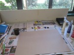
My studio space (ready to paint)
Acrylic paint and brown card
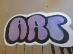
I tried colouring the insides of my letters, exploring different colouring styles
I was enjoying playing with colour but I still was not satisfied with the shaping of my lettering (getting a little bit fussy)
Re-shaping the lettering and also trying to get rid of the drips by creating a white outline behind the black
The lettering needs a ‘little-wee-bit’ of editing but I personally feel that I am beginning to understand how I want my words to look, my colouring needs sorting out though
For the actual website I would edit the writing, making It say: “The Mind Of The Native”
I had a little practice on Photoshop trying to edit my Logo design for the website. I found It quite difficult and time consuming, using the computer gave me less time as I had to work with pixels. If I could use spray paint, It would help a whole lot more as I could get a lot more done visually faster and also think It would be a good learning experience. I feel that my Photoshop skills are developing also, so thats a bonus!!
I’ve had another try at re-creating my Logo using The Adobe Ideas App, I tried two colour combinations that I am planning on experimenting on the home page of my blog to see the effectiveness of dark and bright colours being placed over a black background.
Initial sketch
Redrawn on iPad
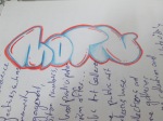
I tried editing the letters a little bit, I found That I don’t have as much control of the lettering when using the iPad compared to when I draw in my book. I think I would like to have a practice using spray cans
I tried adding A little 3 dimensional effect to the letters
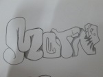
I was researching into ‘throw’ up style graffiti , trying to manipulate the shapes of the letters. trying to create ‘bubble like’ writing
This looked quite tacky to me, so wasn’t too pleased with this one
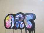
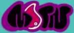
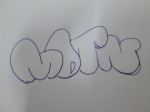
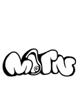
M.O.T.N.
Colour combos
In my notes
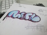
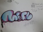
trying purple and blue combinations, and drip effects
purple black and blue, 3d style lettering
I have been having a little practice with the Logo for the website, just doodling in my sketchbook and trying to get better at graffiti. I think I need to research more street artists, or maybe try their methods of creating works, E.G. sprayed on a wall, or spayed in place of significance. I will then perhaps take a photo of the work and try see what I can do on photoshop.
I am beginning to Generate ideas for creating a website. On this website I am wanting to create a gateway for people from indigenous cultures to be able to express themselves whether it be in Art, Music, Film, Poetry etc. I feel that this a great way for New Zealand and hopefully the rest of the world, to understand how the minorities feel about certain issues and also witness the creativity and talents they possess.
The reason why I want the site to focus on people from indigenous cultural backgrounds is because I feel that our cultures are what makes us unique. When we reflect back to our cultural heritage is when we begin to discover new ideas that can be brought into westernised practice that more people can appreciate, learn and expand from.
One example of a minority group that took westernised practice into their hands and began creating something new to pop culture was the African-Americans. They created the Hip-Hop movement, creating Music, Dance and Art that expressed themselves. I love Hip-Hop as I can appreciate the creativity in it and I wanted to somehow express this in the presentation of the website.
My focus for the websites Logo is to be based on classic Graffiti of the 80’s, as I see the potential in this style of Art. The thing that attracted me the most about Graffiti was the idea to create a new identity/name for yourself, and painting it up everywhere for everyone to see and hoping people would admire what you created. So me and another fellow classmate Lincoln TeWhaiti came up with the name “MOTN” (pronounced Moh-Tin) which stands for “Mind Of The Natives.”
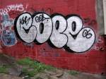
So we began looking into classic “Throwie” styles of graffiti from Artists ‘Cope’ and ‘Seen’ and other references.
I also looked at some websites, this one was of the German Graffiti Artist ‘Cantwo’, I wasn’t really digging the set up of the site but the functionality was simple enough and it had the kind of content I wanted to be within our site. It was very ‘visual’ which is the most important part for me, as I want visitors to have full attention to what’s being presented. It had an urban feel to the site so I found it to be very relevant in regards to our website.
I found another website “Nga Aho” Which was focussing on Maori designers who try to help Maori communities with various designing issues. I found that this websites goals were very similar to mine, in regards of building communities. So I thought it was a perfect website to reference for what we want to accomplish. The set up wasn’t that interesting to me but I still appreciated what it was all about.
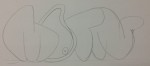
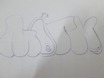
I had a little practice trying to create our ‘urban’ logo, when ever I said ‘MOTN’ quickly I found out that it made out that it sounded like I was saying “mutton” reminding me of lamb. So I tried drawing the ‘O’ in the word as a lamb chop or some sort of meat just playing with the name. Although I wanted to try having a graffiti like Logo, I found that I wasn’t to good at drawing graffiti letters so I wasn’t to pleased with the results. But it was just a practice and I will try developing it until Lincoln and I are both satisfied.
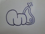
Initial Logo Design
Redrawing on iPad
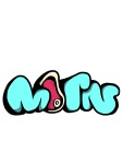
Colour Added
I’ll be looking into more websites very soon and I will continue to work on our Logo, also we will have to find a certain type of template for our website.